Pt.
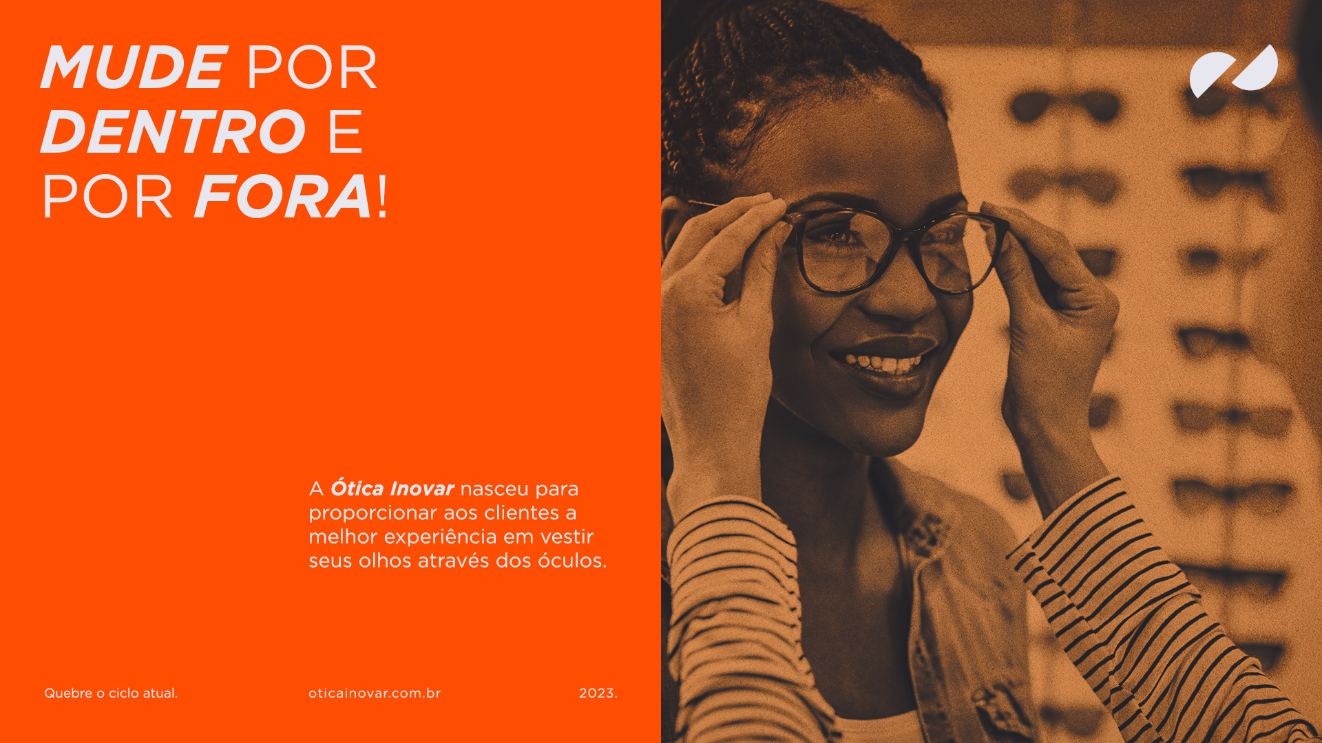
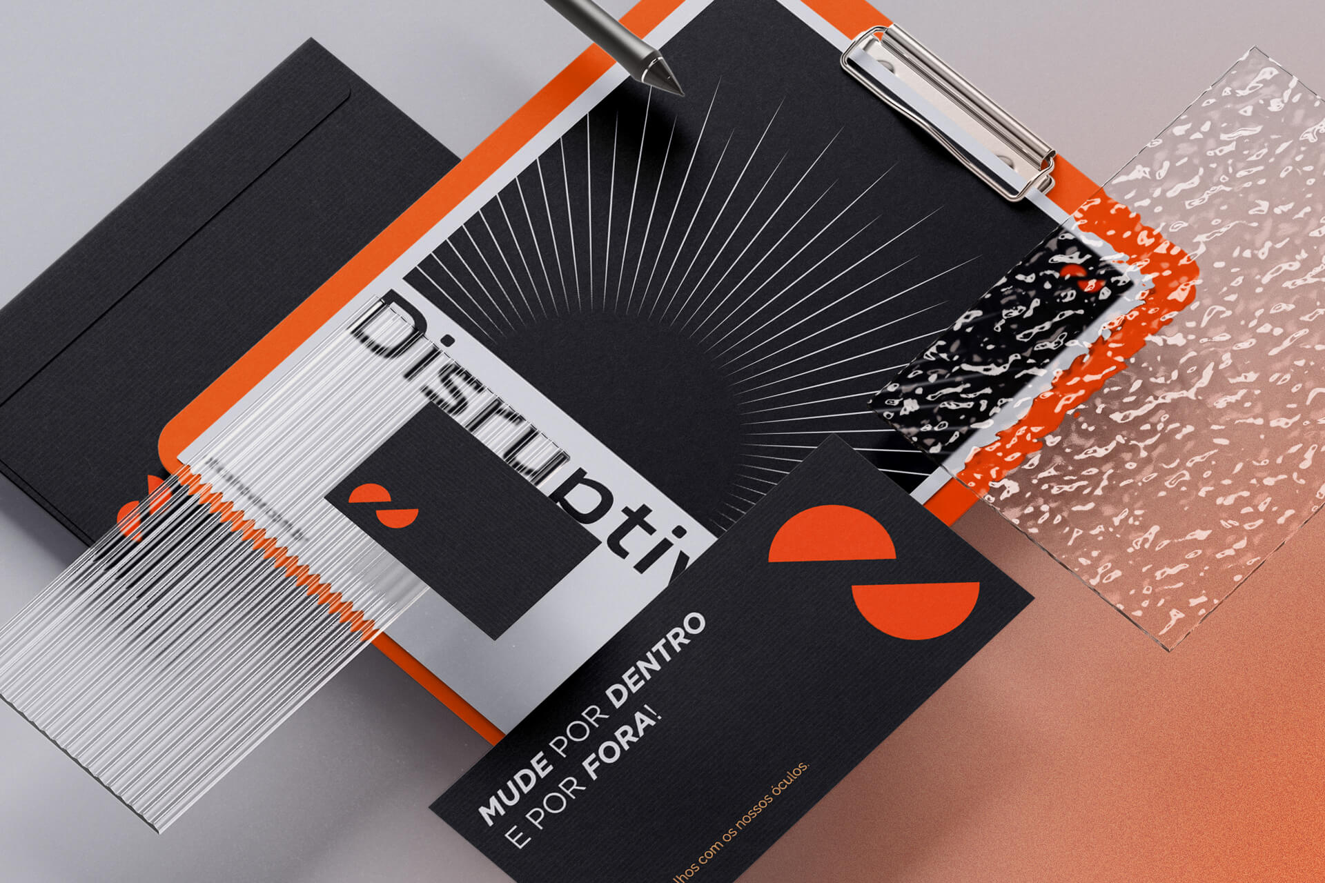
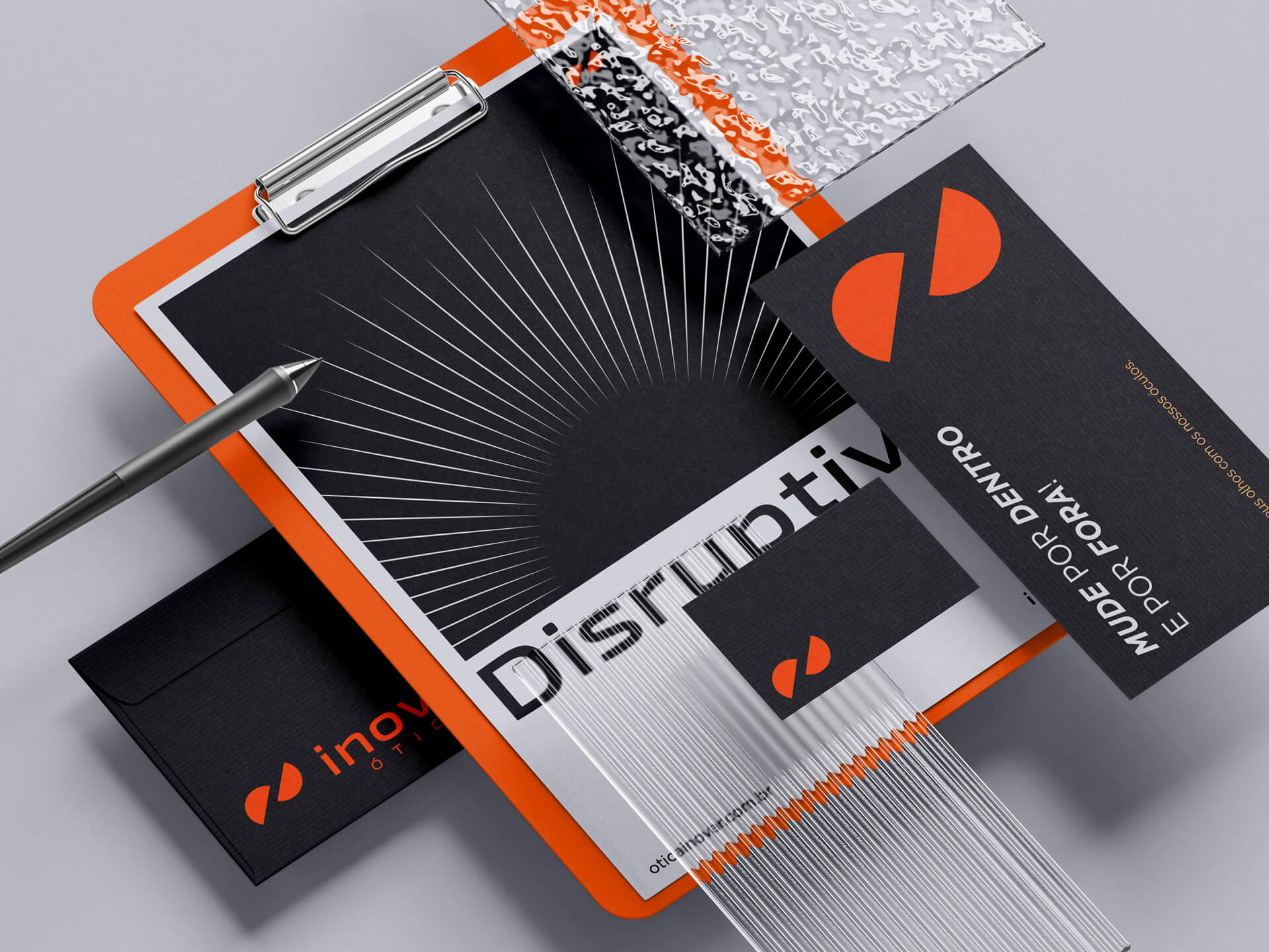
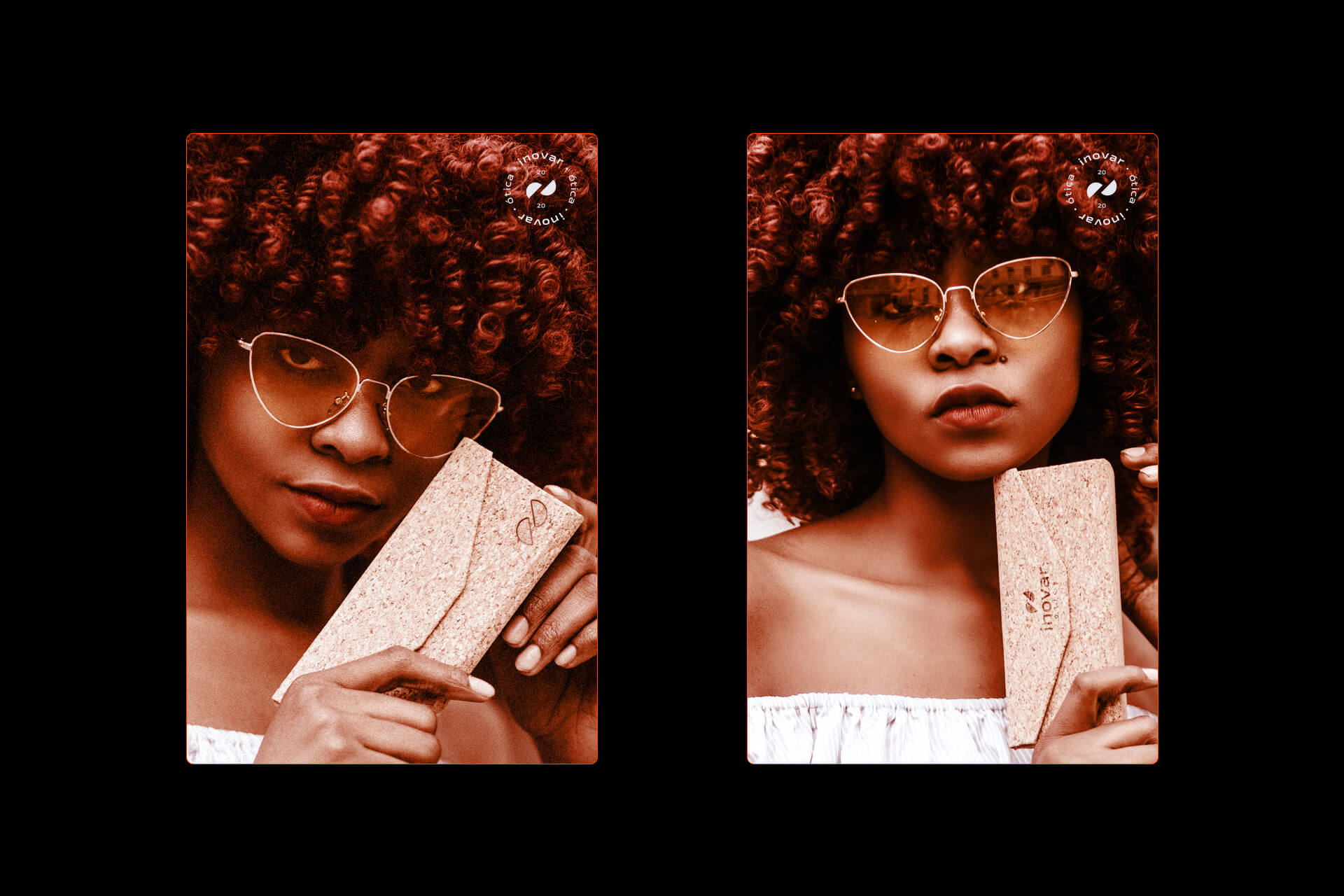
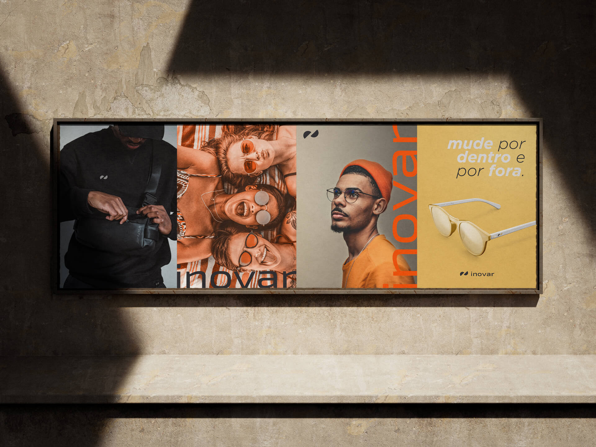
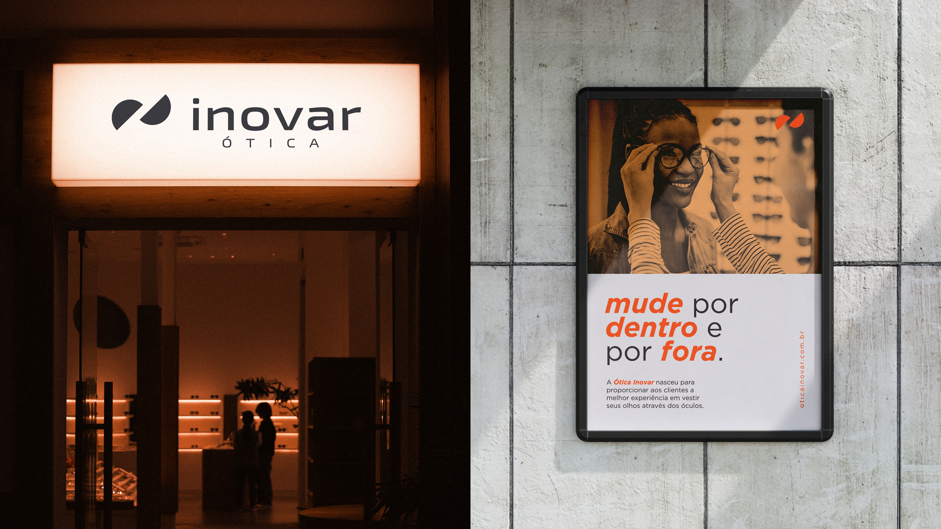
A Ótica Inovar é uma empresa que nasceu para quebrar paradigmas e ajudar seu público com suas dificuldades não apenas físicas e estéticas, mas também suas dificuldades emocionais. O ato da compra de um óculos significa mudança, um novo olhar, tanto na importância de ter uma nova perspectiva sobre a vida no caso de óculos com grau, quanto no quesito estético. E por isso um dos atributos mais fortes da marca é inovação… Mudança, romper com o ciclo atual, mudar por dentro e mudar também por fora.
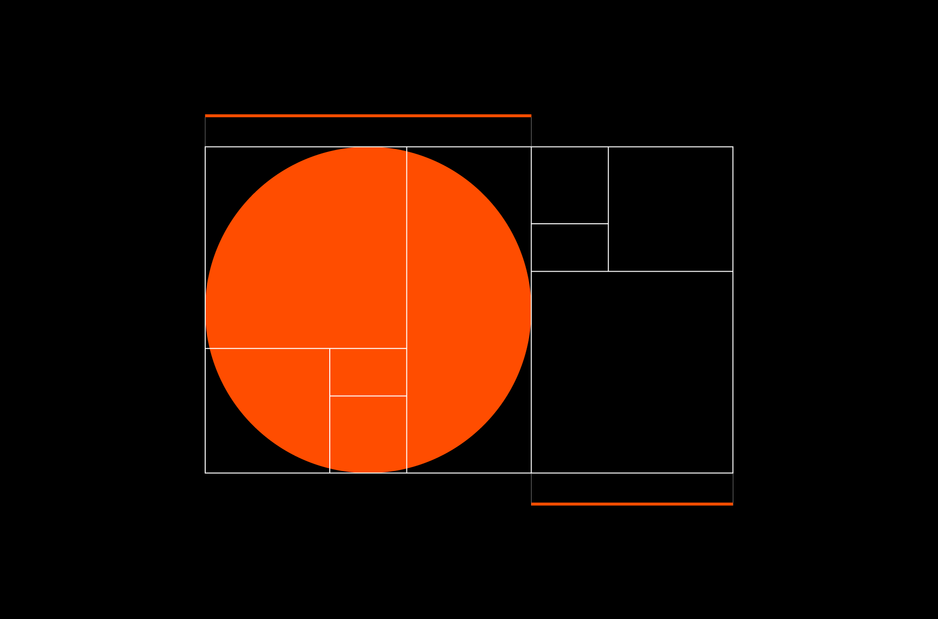
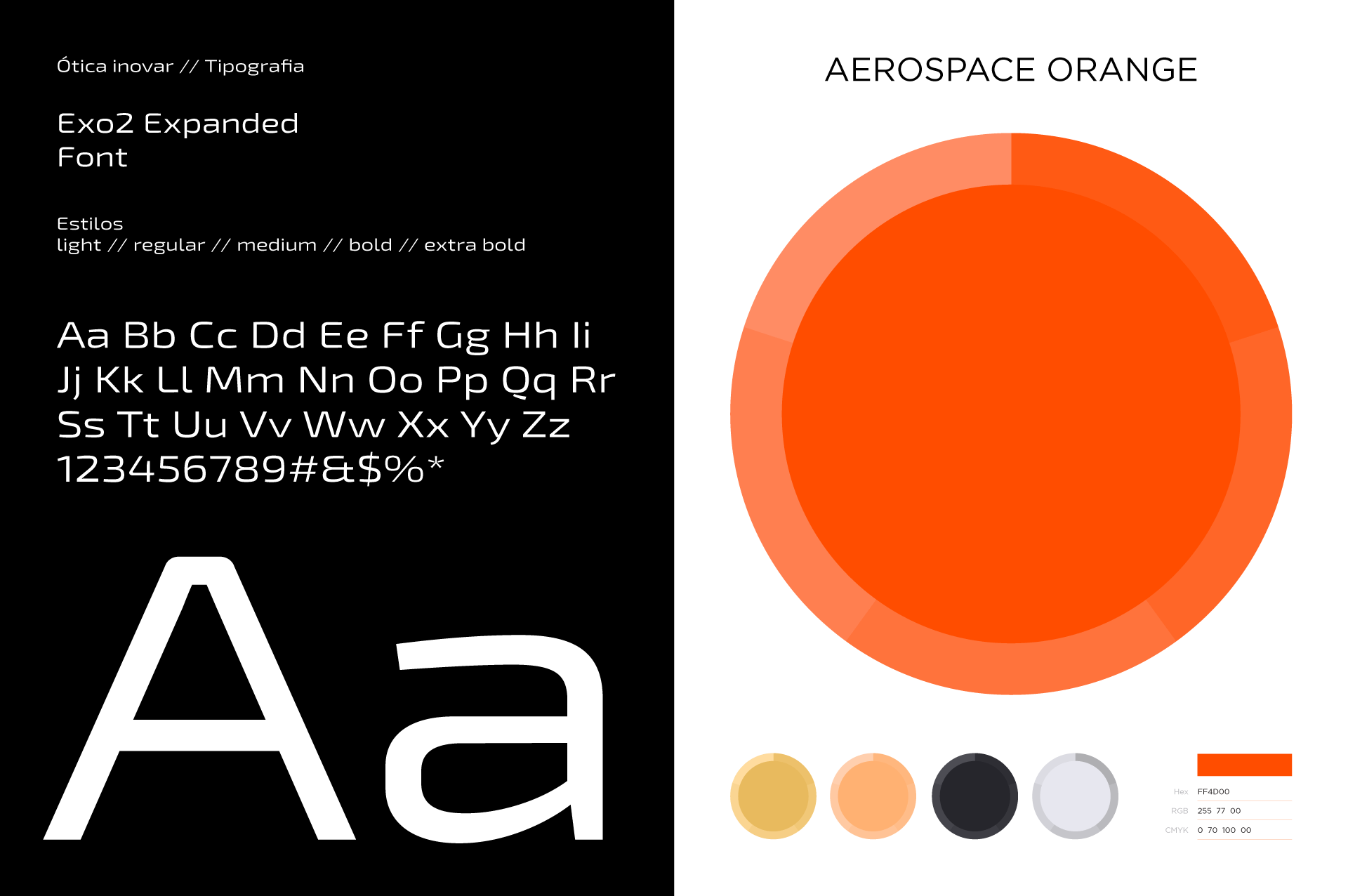
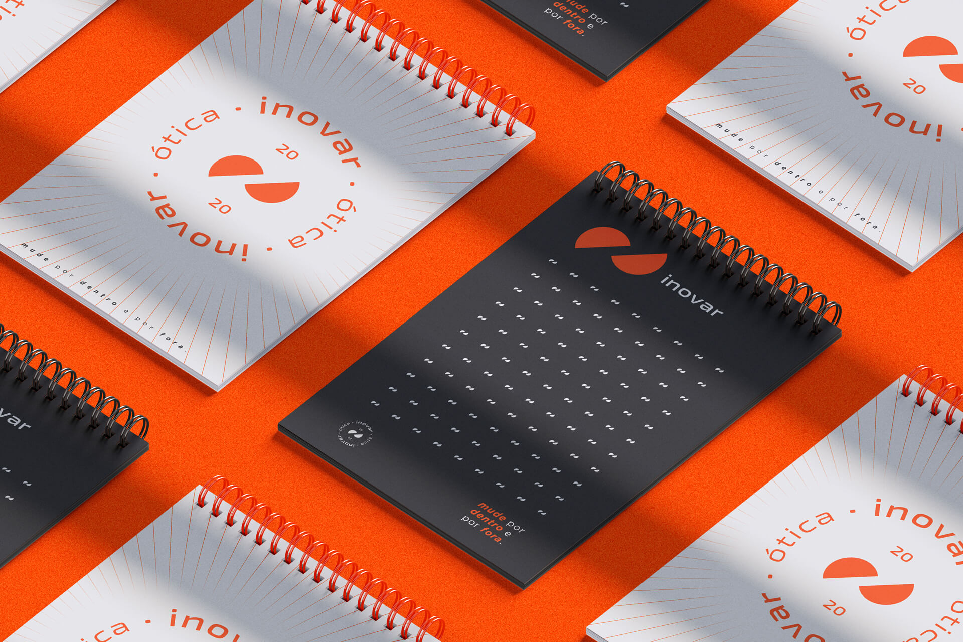
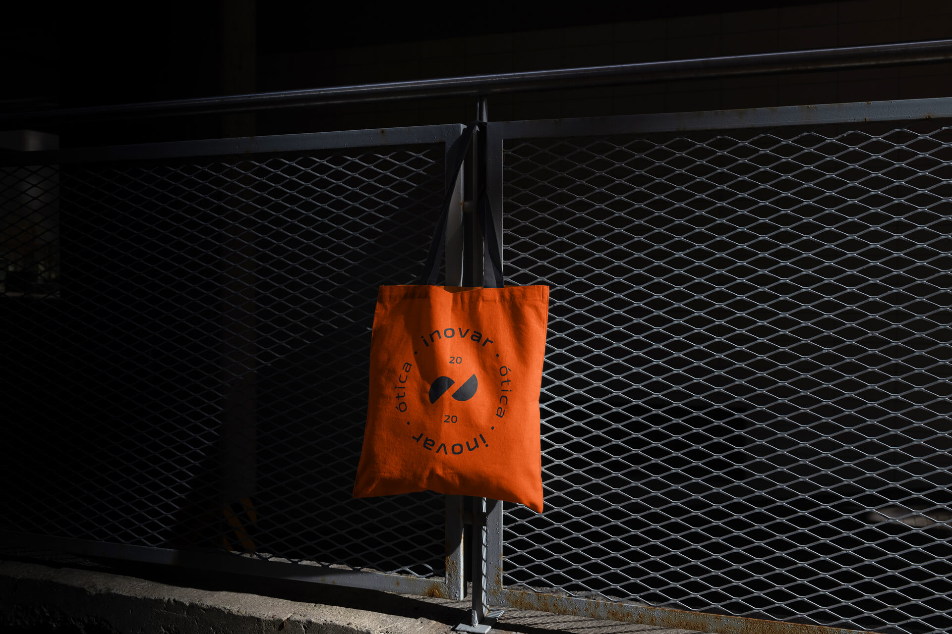
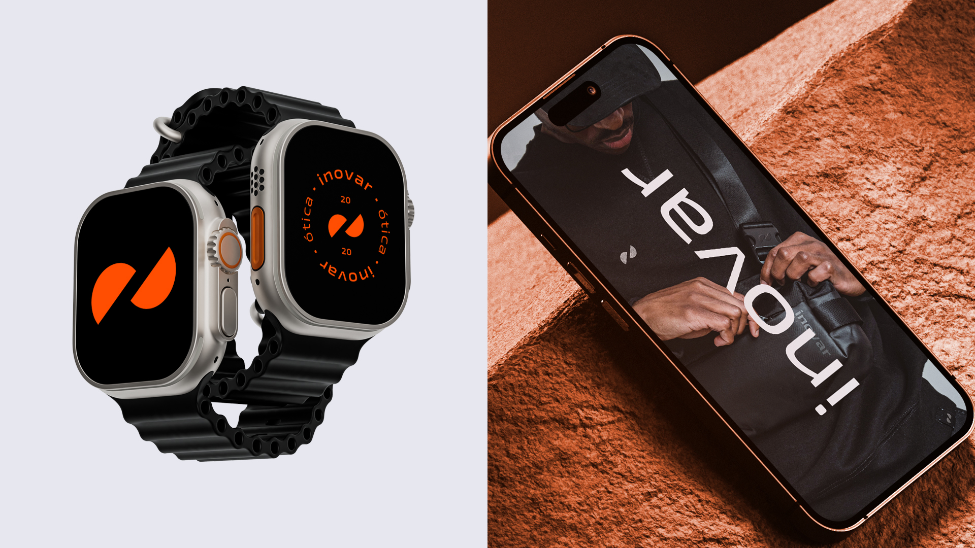
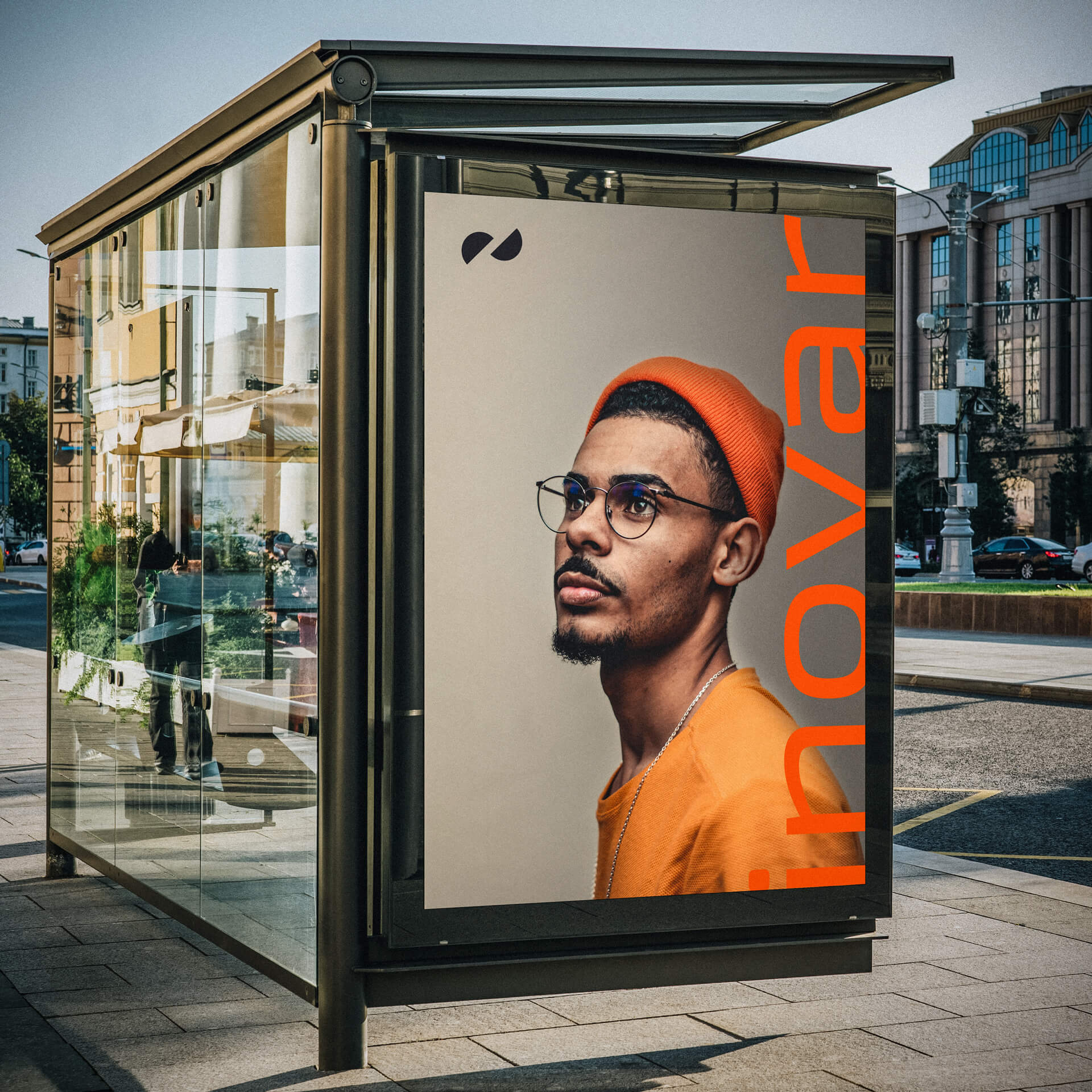
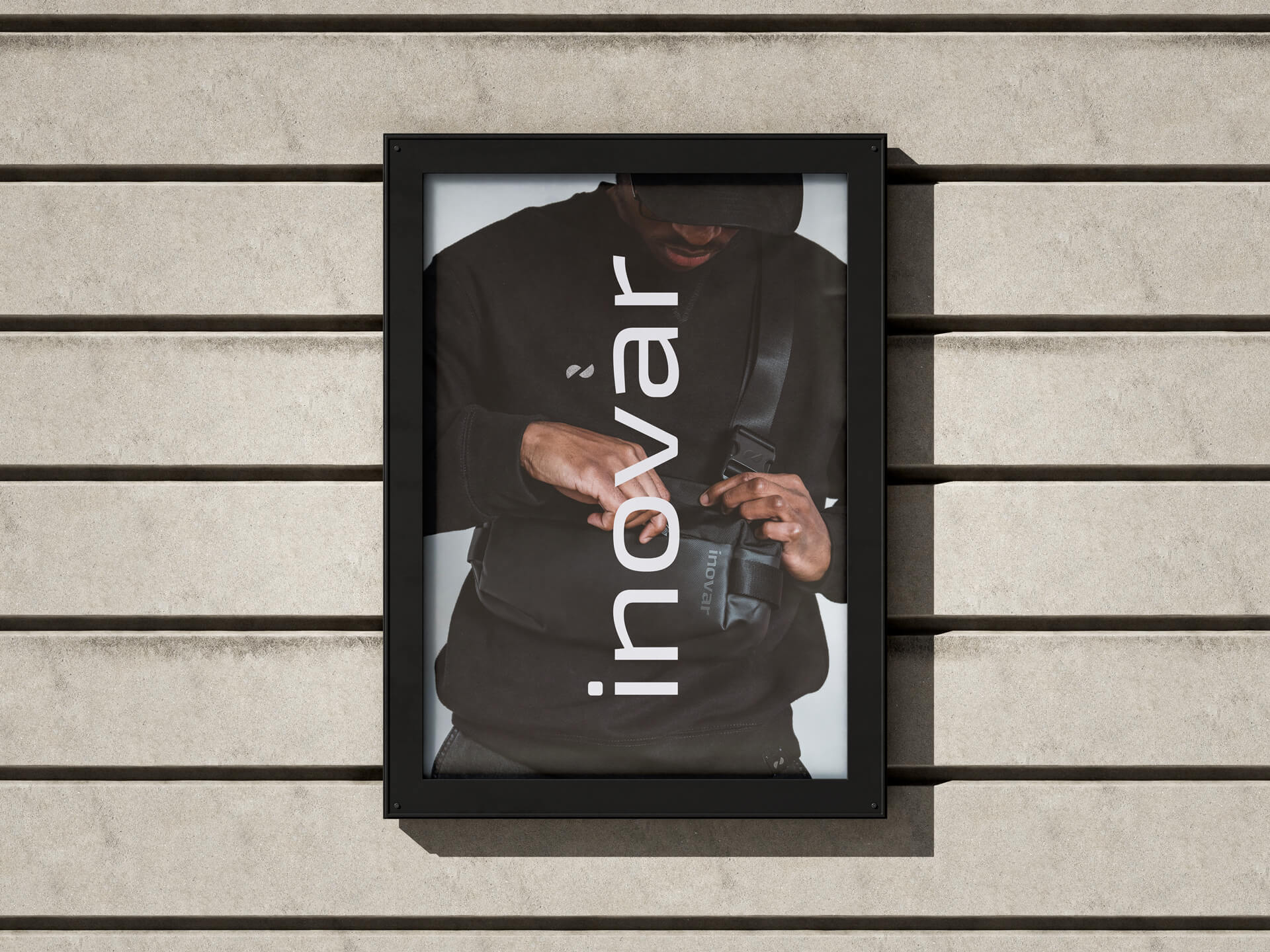
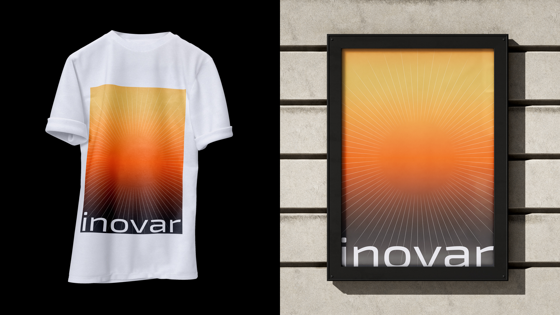
Em 2020, fui contratado para criar a identidade visual da marca, que deveria ter um olhar mais conceitual e contemporâneo. Optamos por uma linguagem mais moderna e simples, que conversasse com todos os tipos de público. O Símbolo nasceu de uma forma geométrica simples, fácil de ser memorizado e aplicado em qualquer plataforma digital ou impressa, e que ainda representa fortementa o conceito da marca.
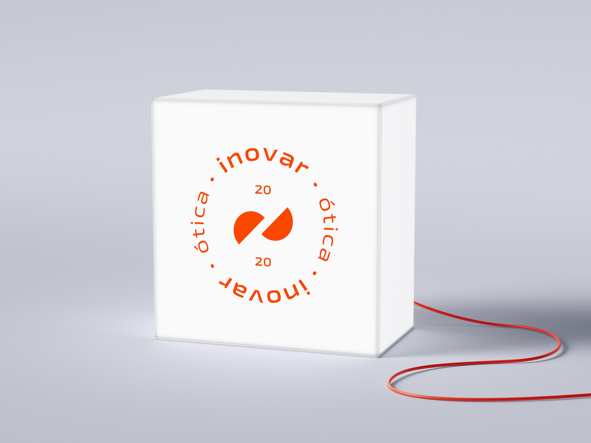
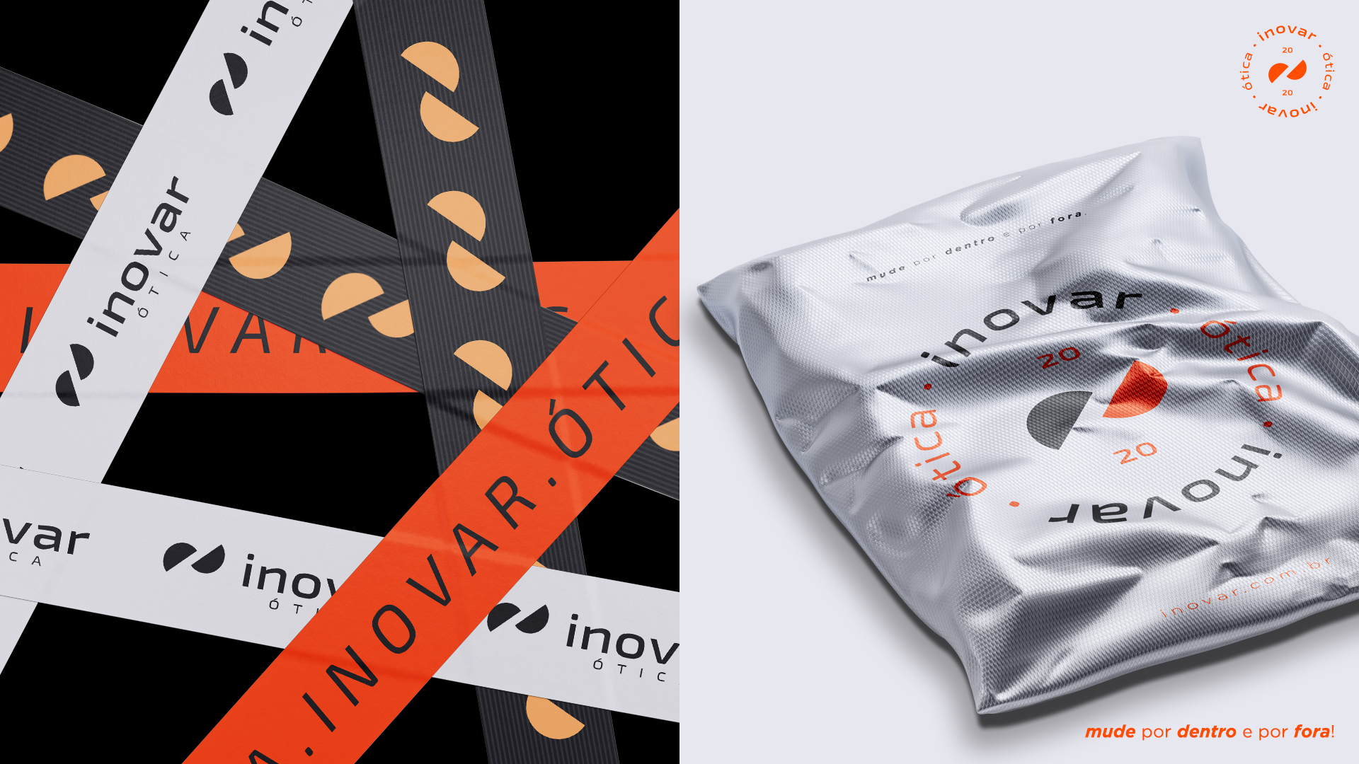
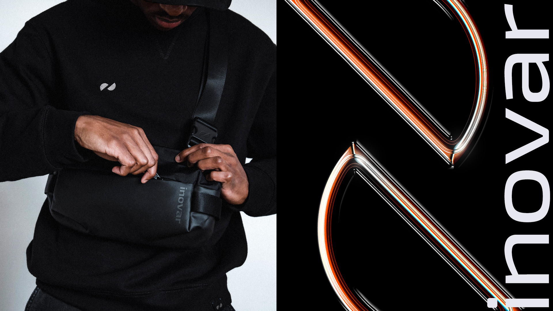
A ideia de um ciclo geralmente é representada por um círculo. Para representar a inovação, que seria a ideia da quebra desse ciclo, a ideia foi criar duas metades de um círculo se rompendo, simbolizando o ato de inovar, sair do ciclo atual.
“O ciclo atual nem sempre é o ciclo ideal, às vezes é preciso romper e sair da bolha, é preciso INOVAR.”
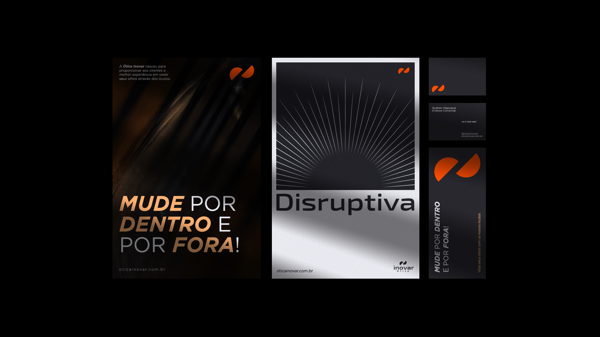
O resultado visual foi uma marca sólida, flexível e com total conexão com seu público-alvo e possui um universo totalmente integrativo e fácil de ser desdobrado em todos os seus pontos de contato. A marca Inovar surge com conceitos extremamente simples o que facilita a e pregnância da marca e faz com que o projeto seja extremamente sólido e longevo.
En.
Ótica Inovar is a company that was born to break paradigms and help its audience with their difficulties, not only physical and aesthetic, but also their emotional difficulties. The act of buying glasses means change, a new look, both in terms of the importance of having a new perspective on life in the case of prescription glasses, and in terms of aesthetics. And that’s why one of the strongest attributes of the brand is innovation… Change, breaking with the current cycle, changing inside and also changing outside.
In 2020, I was hired to create the brand’s visual identity, which should have a more conceptual and contemporary look. We opted for a more modern and simple language that would speak to all types of audiences. The Symbol was born from a simple geometric shape, easy to memorize and apply on any digital or printed platform, and which still strongly represents the brand’s concept.
The idea of a cycle is usually represented by a circle. To represent innovation, which would be the idea of breaking this cycle, the idea was to create two halves of a circle breaking apart, symbolizing the act of innovating, leaving the current cycle.
“The current cycle is not always the ideal cycle, sometimes you have to break and get out of the bubble, you have to INNOVATE.”