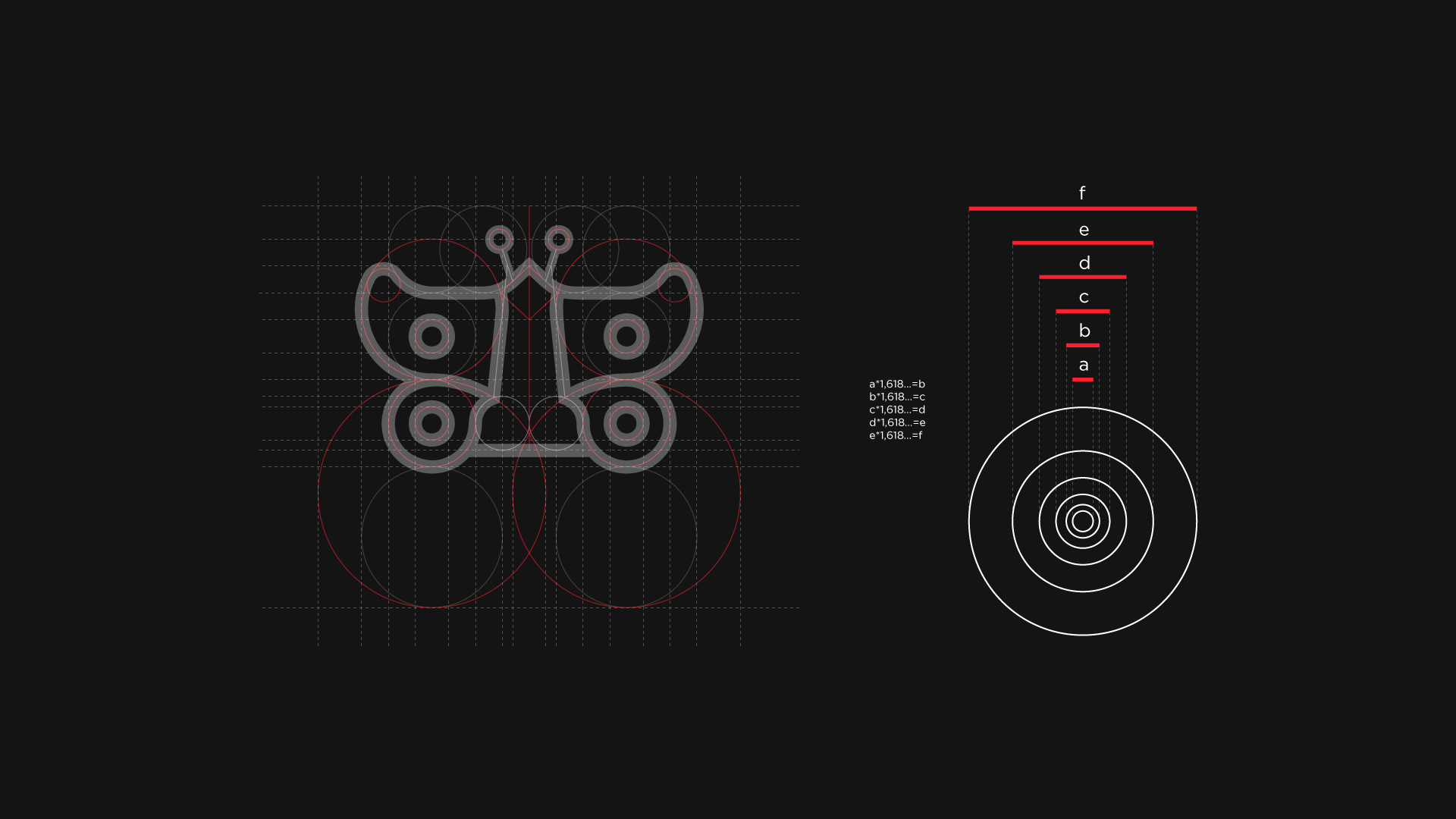
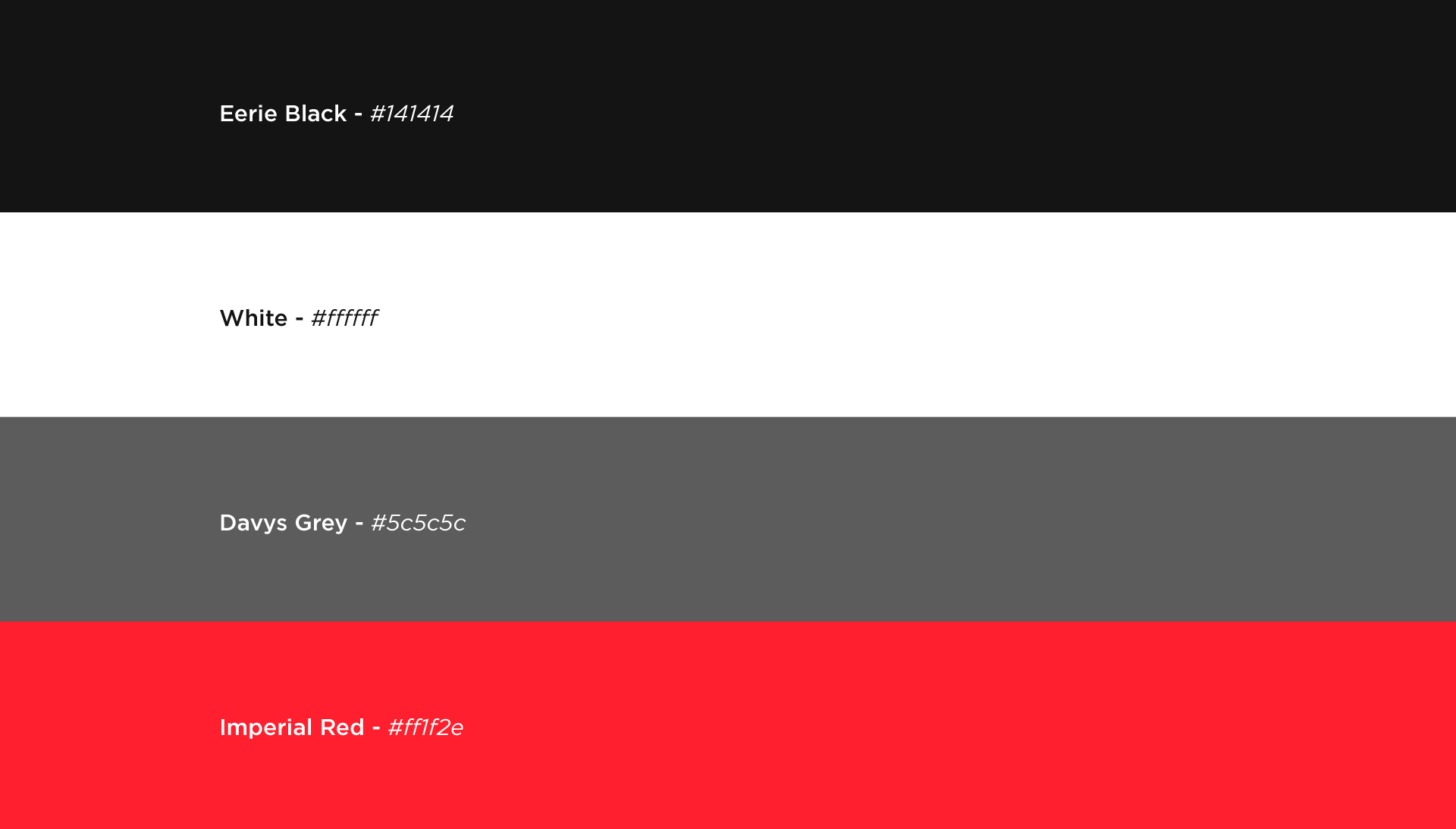
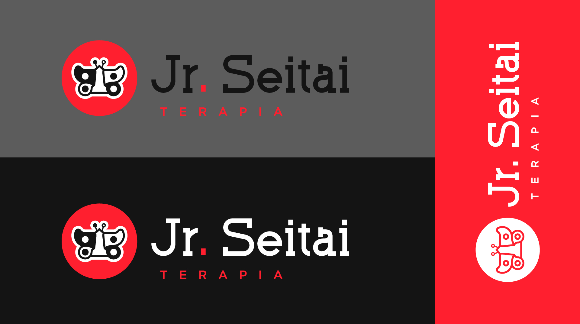
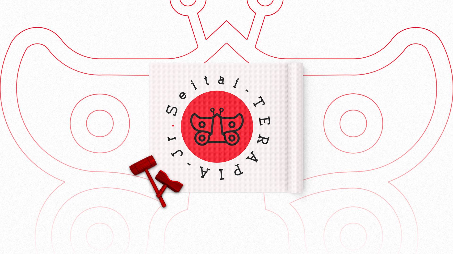
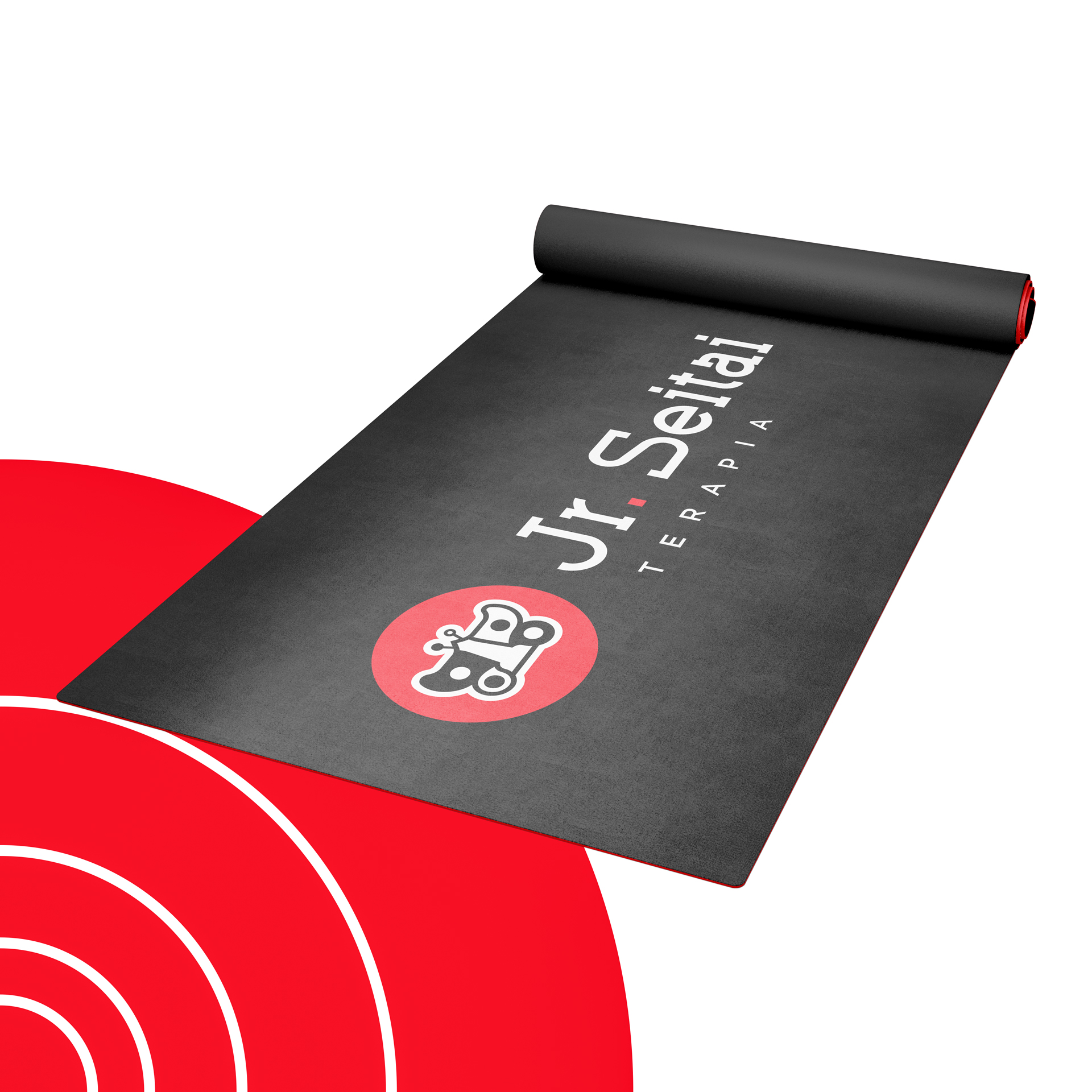
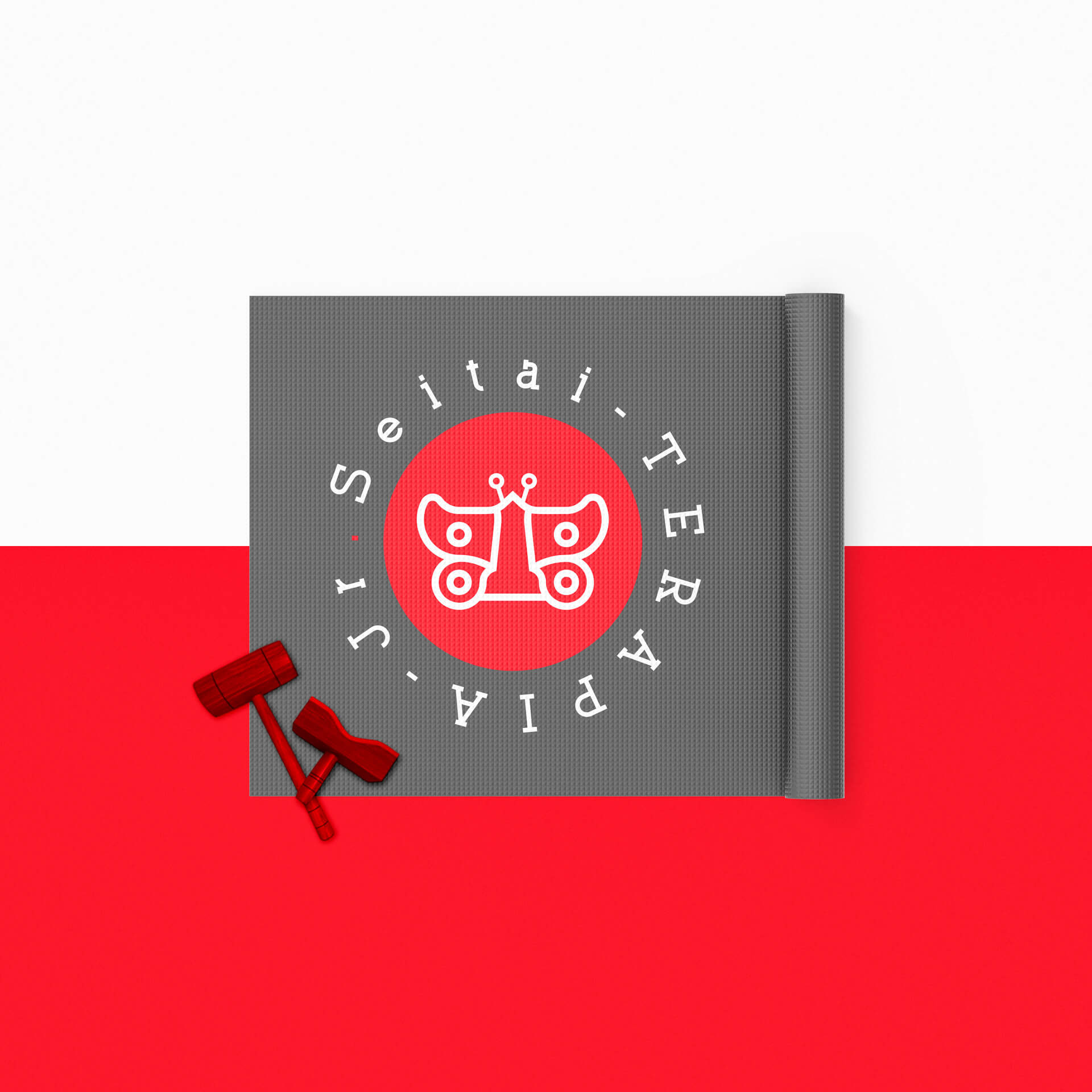
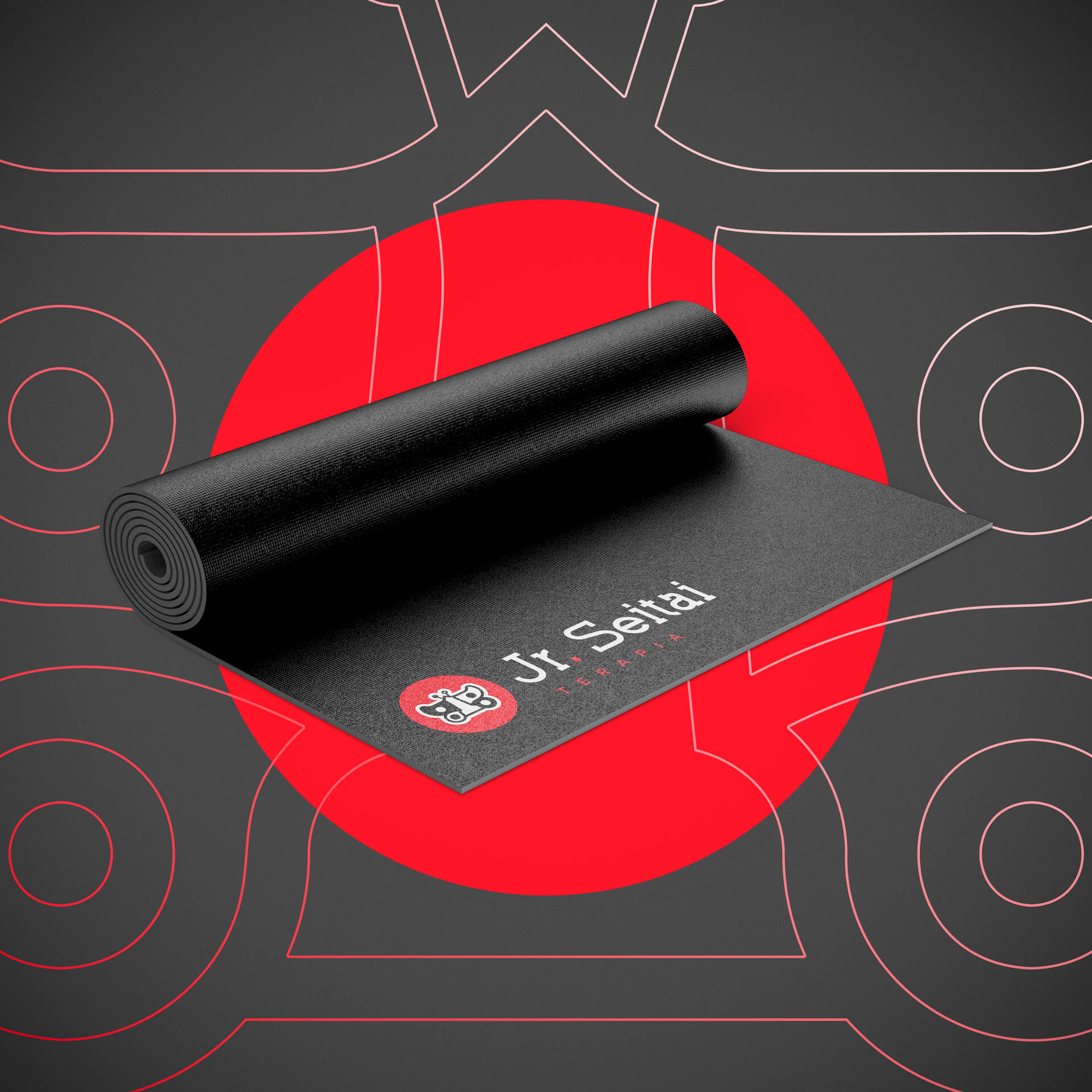
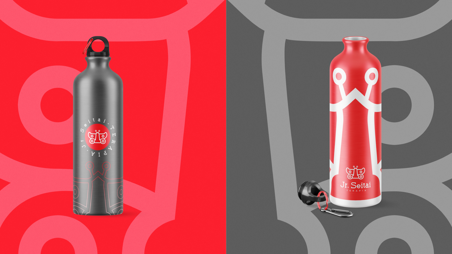
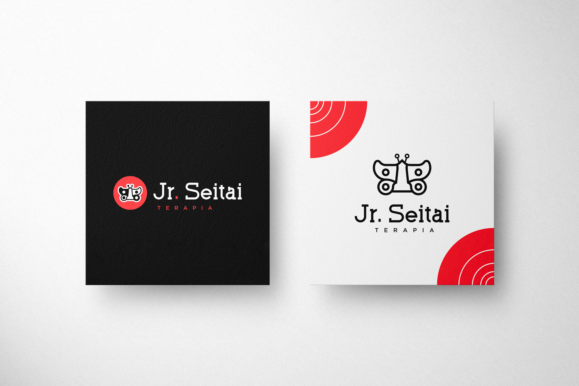
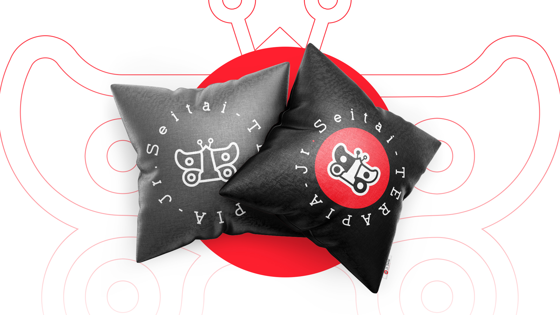
pt | Jr. Seitai Terapia é uma marca que nasceu da necessidade de tratamento através da medicina alternativa para uma pessoa da família.
.
O objetivo da marca é ajudar o maior número de pessoas a se livrarem de dores provocadas por diversas causas. Devolver a qualidade de vida as pessoas que precisam de ajuda.
O objetivo da marca é ajudar o maior número de pessoas a se livrarem de dores provocadas por diversas causas. Devolver a qualidade de vida as pessoas que precisam de ajuda.
.
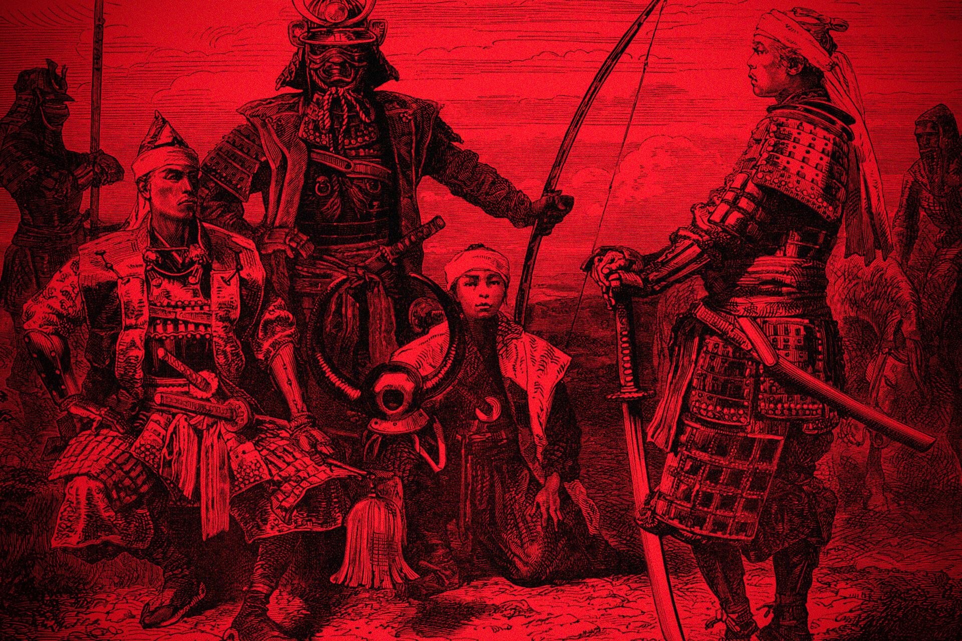
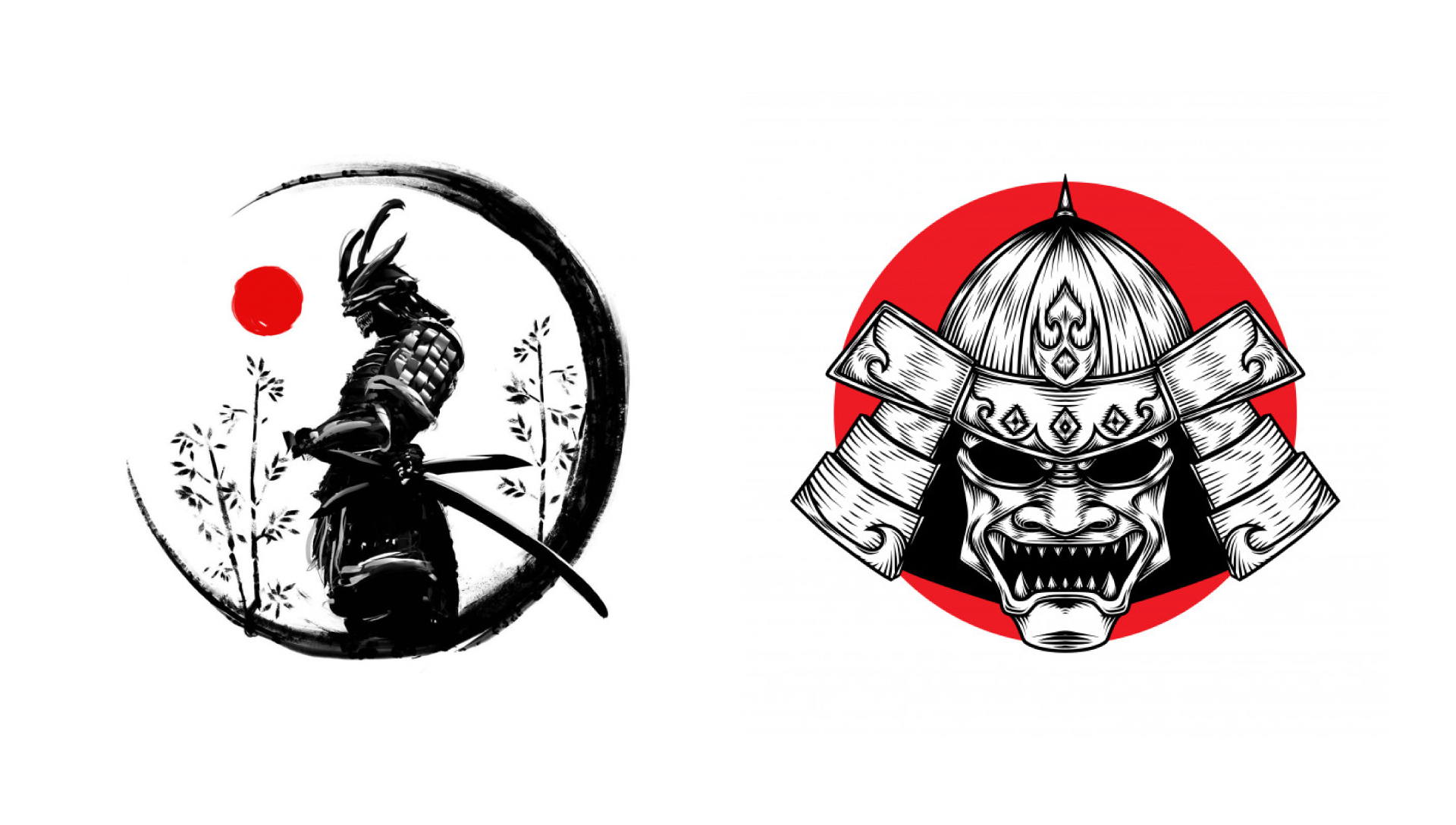
O serviço que a marca oferece é o tratamento muscoesquelético denominado SEITAI. Que é uma técnica japonesa que foi criada entre os séculos XV e XVI, por guerreiros samurais, para ajudar no tratamento de problemas muscoesqueléticos ocorrido em batalhas.
–
en | Jr. Seitai Therapy is a brand that was born out of the need for treatment through alternative medicine for a family member.
.
The goal of the brand is to help as many people as possible to get rid of pain caused by various causes. Return the quality of life to people who need help.
The goal of the brand is to help as many people as possible to get rid of pain caused by various causes. Return the quality of life to people who need help.
.
The service that the brand offers is the musculoskeletal treatment called SEITAI. Which is a Japanese technique that was created between the 15th and 16th centuries, by samurai warriors, to help in the treatment of musculoskeletal problems that occurred in battles.